Overview
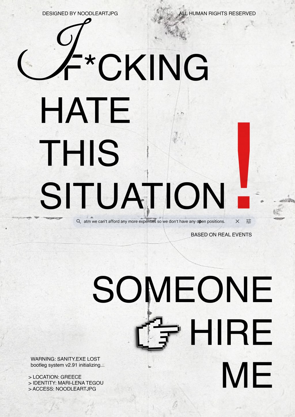
This recent poster I made distills the brutal reality of the contemporary job hunt into a raw, systemic glitch. More than a personal experience, it functions as a visual manifesto for a generation—where financial precarity and professional rejection materialize through the digital decay of a crashing operating system.
Concept & Inspiration
The design mirrors the visceral themes of economic anxiety and fractured identity within a specific geographic context:
- The crushing corporate reply, “atm we can’t afford any more expenses…,” is rendered in cold, matter-of-fact type, acting as the oppressive anchor against which the emotional outbursts violently react.
- The “WARNING: SANITY.EXE LOST” alert is the conceptual core, framing mental exhaustion not as a feeling but as a critical system failure within the “bootleg system v2.91” of the self.
Materials & Techniques
Digital Imperfection & Glitch Aesthetics:
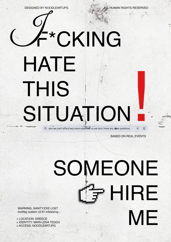
- The composition leverages the visual language of system crashes and corrupted data. Text blocks overlap and collide, mimicking cognitive overload and the destabilizing effect of constant rejection.
- The ironic, corporate-style watermark “DESIGNED BY NOODLEART.JPG ALL HUMAN RIGHTS RESERVED” is applied with deliberate absurdity, commenting on the commodification of the self even in a state of non-employment.
Analog Brutality:
- The aggressive, all-caps typography of “F*CKING HATE THIS SITUATION” has the visceral impact of something spray-painted or shouted—a moment of pure, unfiltered catharsis breaking through the digital facade.
Color Palette & Typography
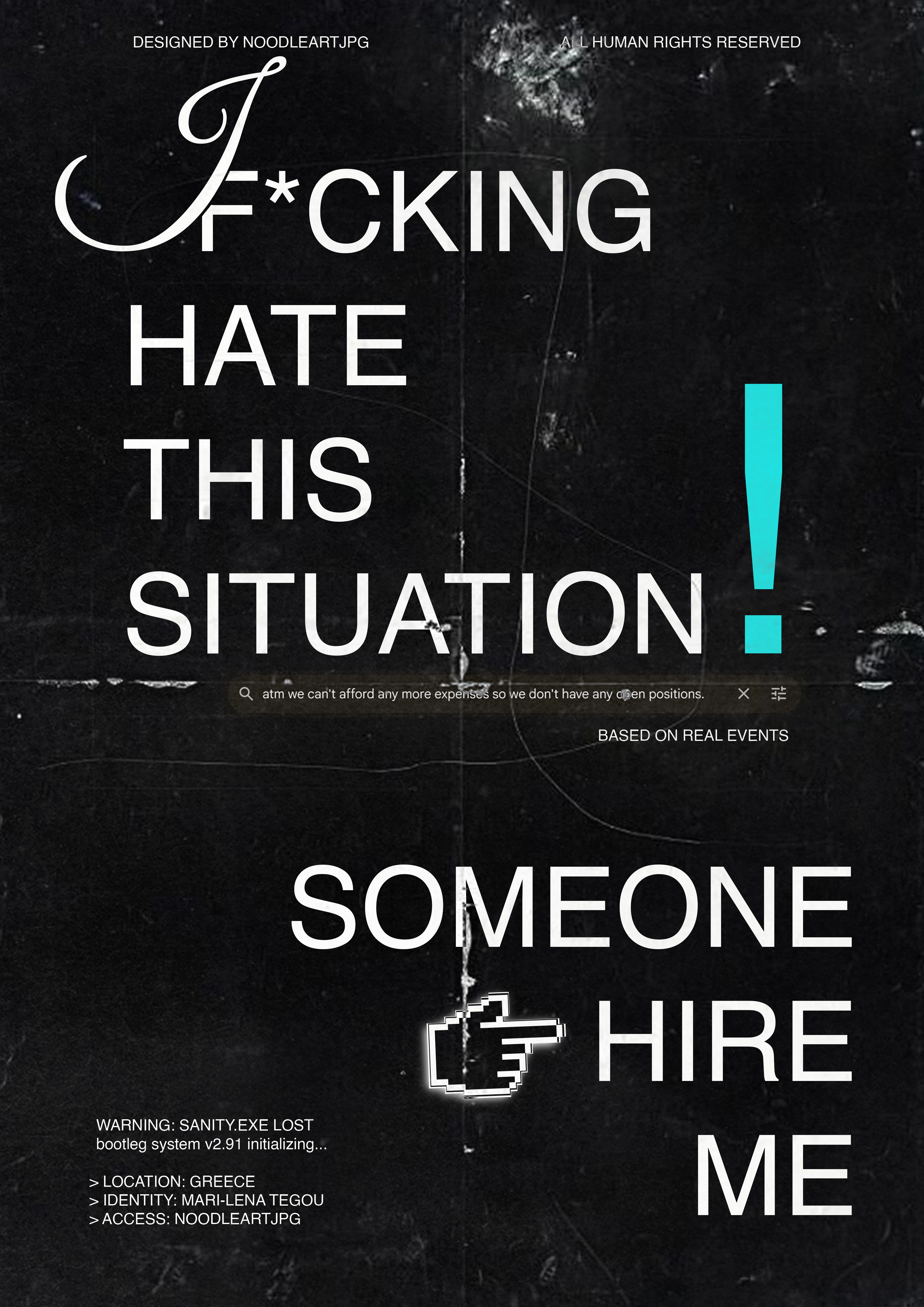
Monochrome Despair:
- A stark, high-contrast black-and-white palette dominates, evoking bureaucratic documents, error messages, and a world drained of hope. There are no comforting colors here; the aesthetic is one of pure information and stark reality.
Typographic Dissonance:
- The typewriter-esque fonts reinforce a sense of transactional communication (cover letters, applications) while the erratic sizing, spacing, and alignment—from the tight kerning of the watermark to the shattered layout of the main text—visually mimic erratic thought patterns and escalating anxiety.
Visual Impact
This poster doesn’t just express a desire for work—it accuses and implicates. The chaotic, confrontational composition forces the viewer to witness the emotional fallout of a broken economic promise. It balances raw, human emotion with the meticulous craft of glitch art; every fragmented line and system alert feels intentional, a mirror to the artist’s signature blend of chaos and control.
Held in hands, the texture would feel like a crumpled rejection letter; viewed from afar, it becomes a stark monument to the silent, screaming frustration of “LOCATION: GREECE,” and the global experience of talented inertia it represents.
