Overview
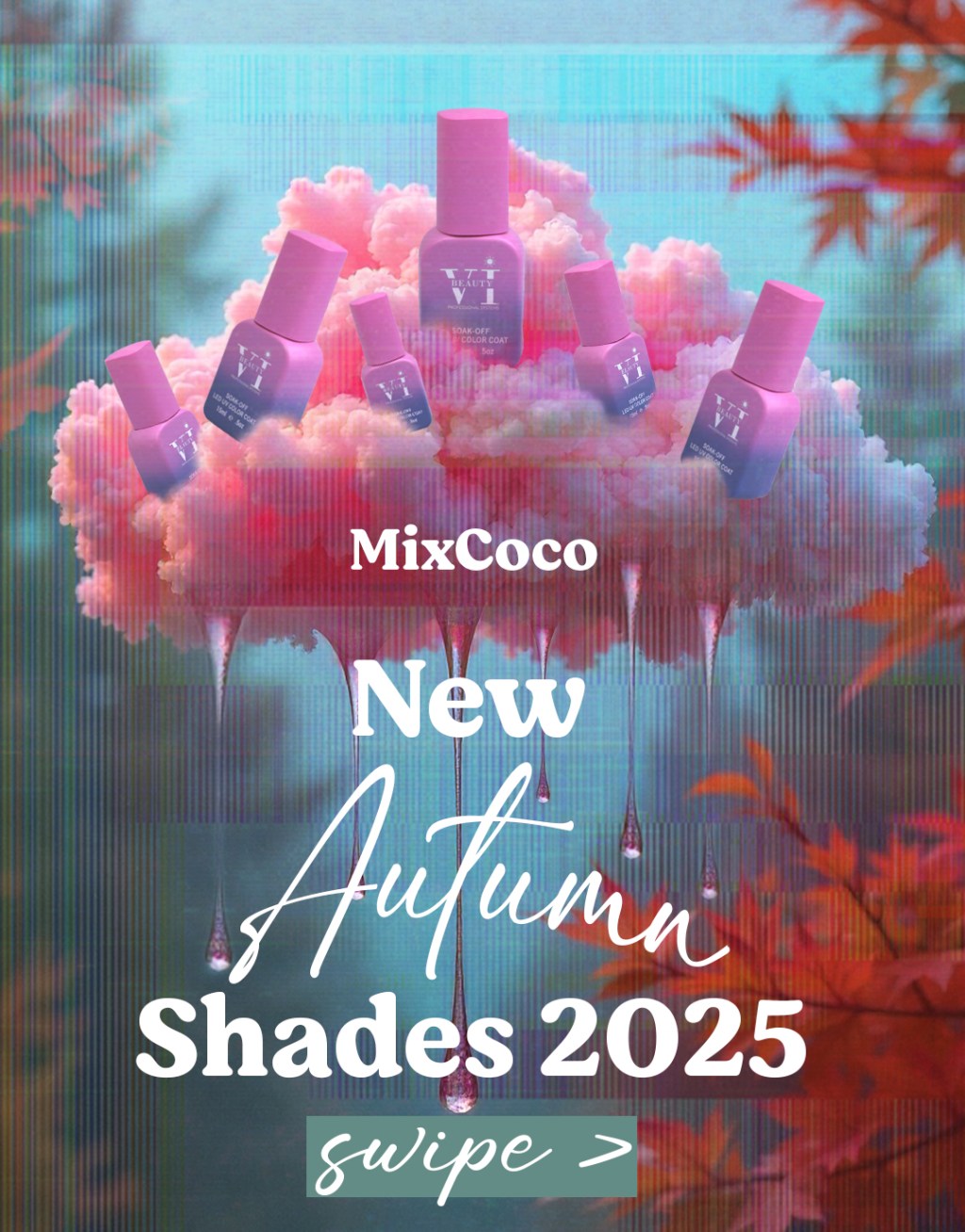
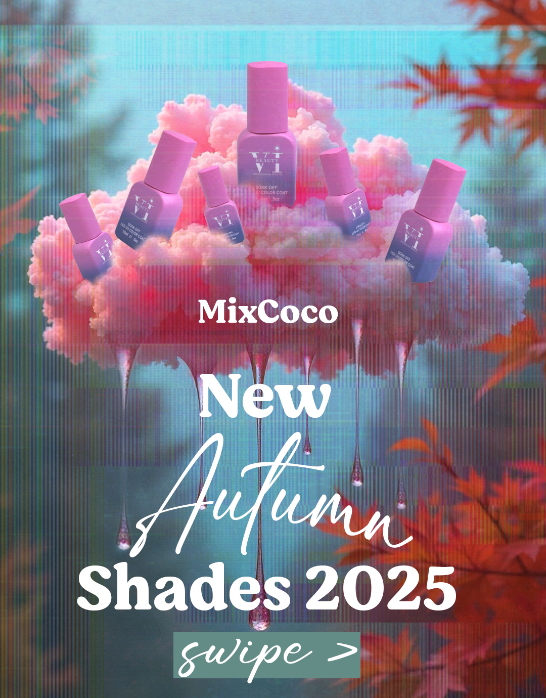
This social media campaign for MixCoco introduces the Autumn 2025 gel polish collection with a vibrant, surrealist twist. It transforms product promotion into a sensory experience — equal parts dreamy escapism and hyper-feminine fantasy. Designed to captivate the scroll-hardened eye, the visuals blur the boundary between editorial luxury and playful fantasy, positioning the brand as both trend-savvy and emotionally resonant. More than an ad, it functions as an immersive palette drop: a cloud-borne vision of seasonal beauty, dripping with whimsy and desire.
Concept & Inspiration
Digital Dream Logic:
- A rich blend of 3D-rendered textures and pastel-on-pastel color grading form the visual foundation. This gives the composition a candy-coated surrealism — playful yet premium.
- The slight vertical glitch lines embedded in the background offer a subtle nod to digital interference or VHS nostalgia — an aesthetic cue popular in fashion-forward or Y2K-inspired branding.
Commercial Symbolism:
- The nail polish bottles are placed like icons in a constellation, creating a beauty altar. This positions the product as the centerpiece of desire, framed by fantasy rather than functionality.
Materials & Techniques
Chromatic Seduction:
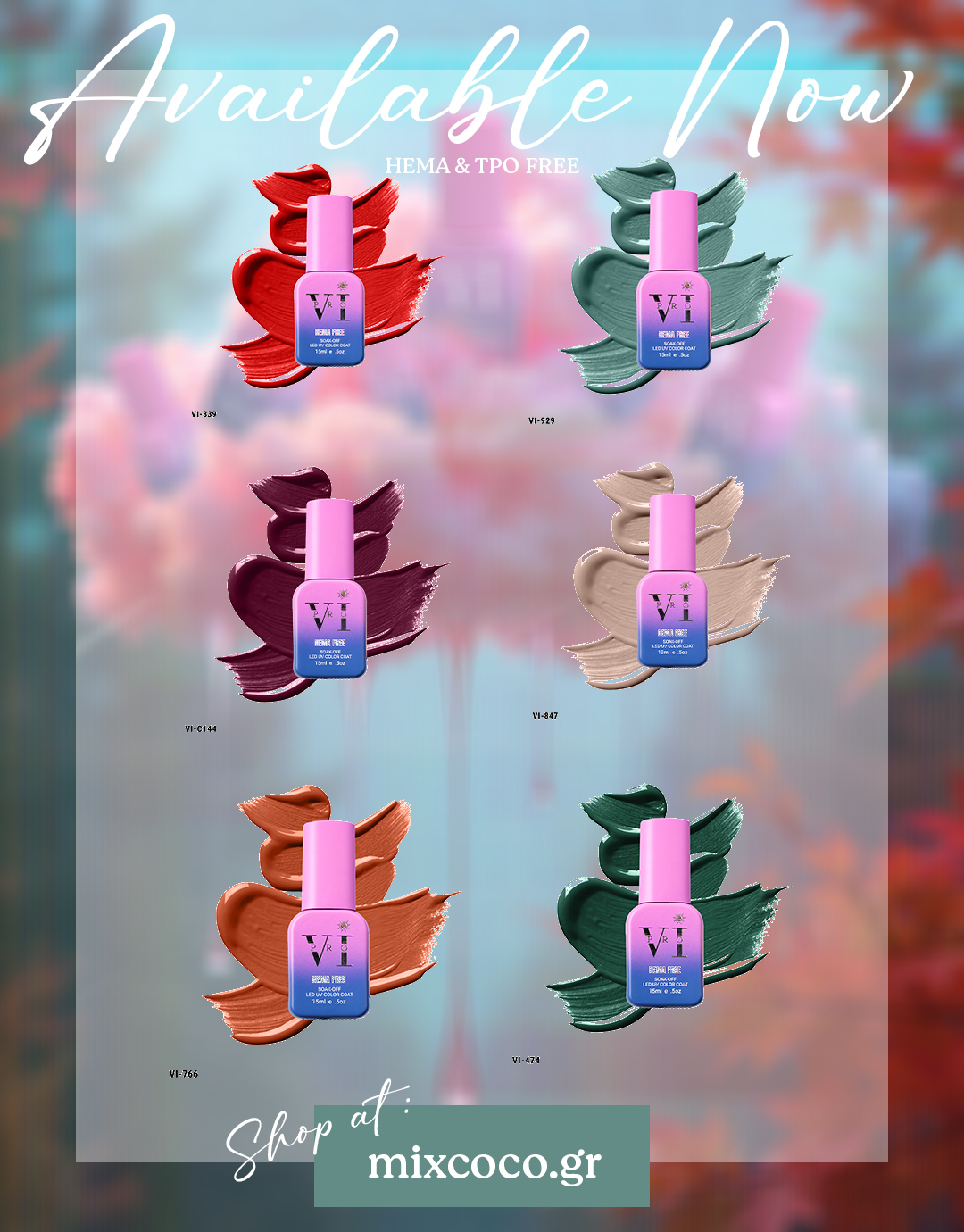
- A hyper-saturated blend of rosy pinks, crimson reds, moody greens, and antique golds creates a sense of lush abundance. The palette evokes fallen leaves, velvety fabrics, and indulgent desserts — sensory shorthand for autumn luxury.
- Pastel skies and diffused light tones give the image a softness that tempers the vibrancy, adding emotional intimacy.
Color Palette & Typography
Chromatic Seduction:
- A hyper-saturated blend of rosy pinks, crimson reds, moody greens, and antique golds creates a sense of lush abundance. The palette evokes fallen leaves, velvety fabrics, and indulgent desserts — sensory shorthand for autumn luxury.
- Pastel skies and diffused light tones give the image a softness that tempers the vibrancy, adding emotional intimacy.
Typographic Soft Power:
- The cursive “Autumn” and “Available Now” typography feels handwritten, feminine, and aspirational — evoking the personal touch of seasonal journaling or handwritten letters.
- The pairing of this script with bold, all-caps sans serif in “Shades 2025” and product names creates a contrast of elegance and clarity — soft charm meets commercial authority.
Visual Impact
This Instagram post doesn’t just promote nail polish — it seduces through aesthetic immersion. It speaks to a consumer not just through features, but through mood and fantasy. The scene pulls the viewer into a pastel-drenched moment of indulgence, while the clean layout and polish identifiers ground the dream in practical retail logic. The campaign’s strength lies in its ability to evoke both intimacy and spectacle: it’s a whisper and a show. In hand, it feels like flipping through a high-fashion editorial. On screen, it acts like a window into a magical version of autumn where beauty drips from the sky and every detail promises soft transformation. This MixCoco campaign bridges commercial clarity and emotional fantasy. Whether viewed quickly on a phone screen or examined closely, it delivers on both aesthetic appeal and product positioning, making beauty feel not just attainable, but enchanting.


