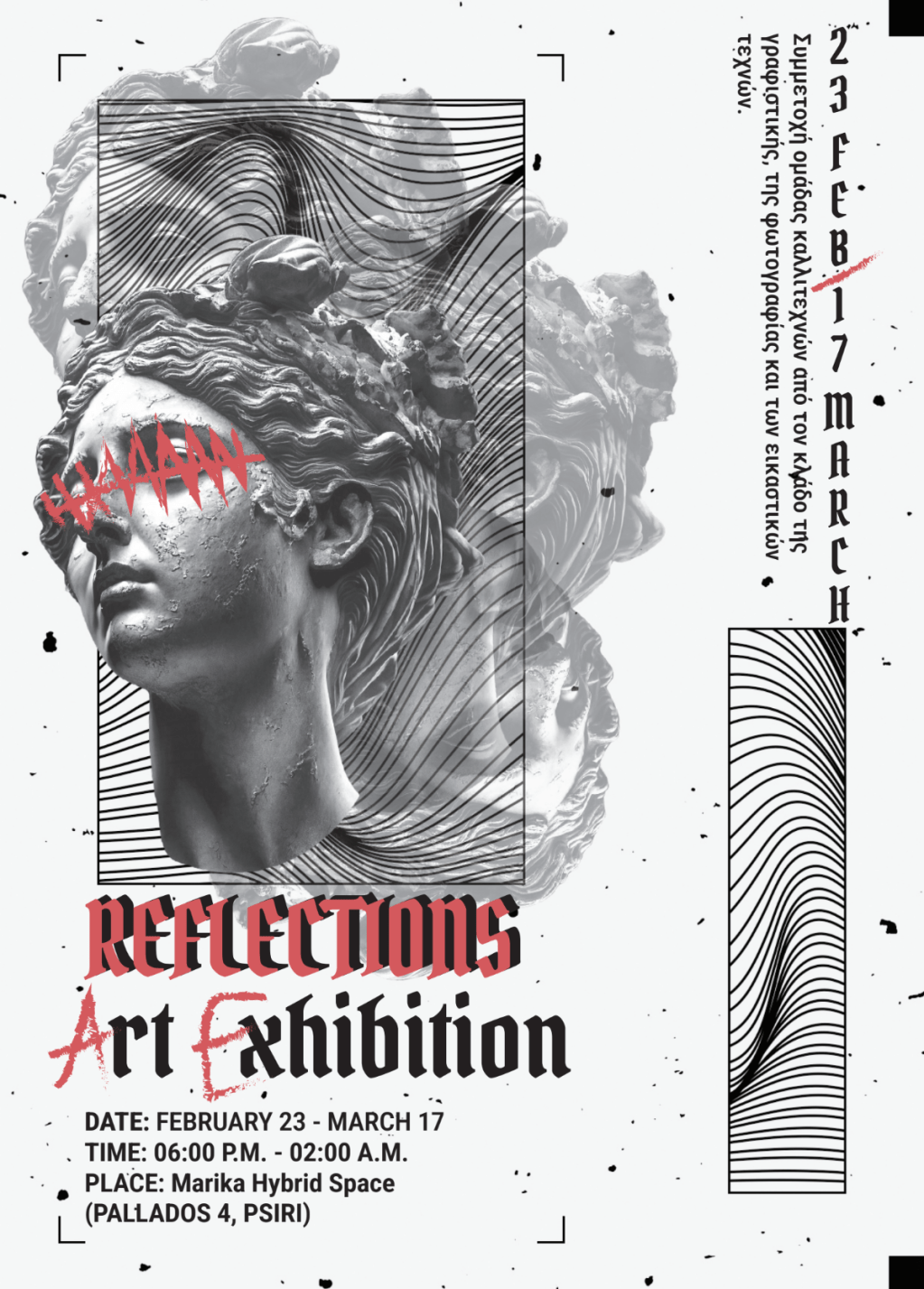

Project Overview
This exhibition flyer announces REFLECTIONS, a multidisciplinary showcase uniting graphic design, photography, and visual arts. Striking in its simplicity, the design serves as a conceptual gateway to the event, balancing stark typography with intentional omissions to provoke curiosity. It functions as both an informational piece and an artistic statement, mirroring the exhibition’s experimental ethos.
Concept & Inspiration
The flyer draws power from its contradictions. The rigid monospace typography suggests digital precision, while the intentional “glitch” in the title undermines this perfection—much like how the participating artists (graphic designers, photographers, visual artists) each disrupt and redefine their mediums. The exhibition’s late-night hours (6:00 PM–2:00 AM) are mirrored in the design’s high-contrast black-and-white palette, evoking the liminal space between daylight clarity and nocturnal experimentation. The venue—Marika Hybrid Space in Psiri’s gritty arts district—lends its underground energy to the flyer’s unapologetic minimalism.
Materials & Techniques
Created for both physical and digital realms, the flyer’s design thrives in transition. The absence of imagery turns the paper itself into a canvas, where the stark typography casts shadows like installations in the actual exhibition space. The monospaced font treatment of practical details (date/time/place) recalls the impersonal typography of train schedules or code, subtly questioning how we “schedule” artistic experiences. The triple-hyphen divider serves as both visual break and symbolic bridge between disciplines.
Color Palette & Typography
A study in extremes: the pure black text on white background becomes a literal manifestation of reflection’s duality. The bold, uppercase title weightily anchors the composition, while the narrower monospace details float like footnotes to the main concept. This tension between heavy and light, between presence and absence, mirrors the exhibition’s exploration of how artists interpret “reflection” across mediums.
Visual Impact
This is design as cultural intervention. Posted on Psiri’s weathered walls, the flyer would look equally at home as a gallery piece itself—a meta-commentary on art announcements. The brutal simplicity forces engagement; viewers must complete the word “REFLECTION” in their minds, thus participating in the creative act before even entering the exhibition. By making absence its most powerful element, the flyer perfectly encapsulates the exhibition’s spirit: art exists not just in what’s shown, but in what’s hidden, distorted, or waiting to be discovered. The design’s lasting impression lies in its quiet confidence. Where most event flyers shout, this one whispers—and in doing so, demands to be heard. It demonstrates how radical restraint can be, proving that sometimes the most compelling designs are those that trust their audience to fill in the blanks.
