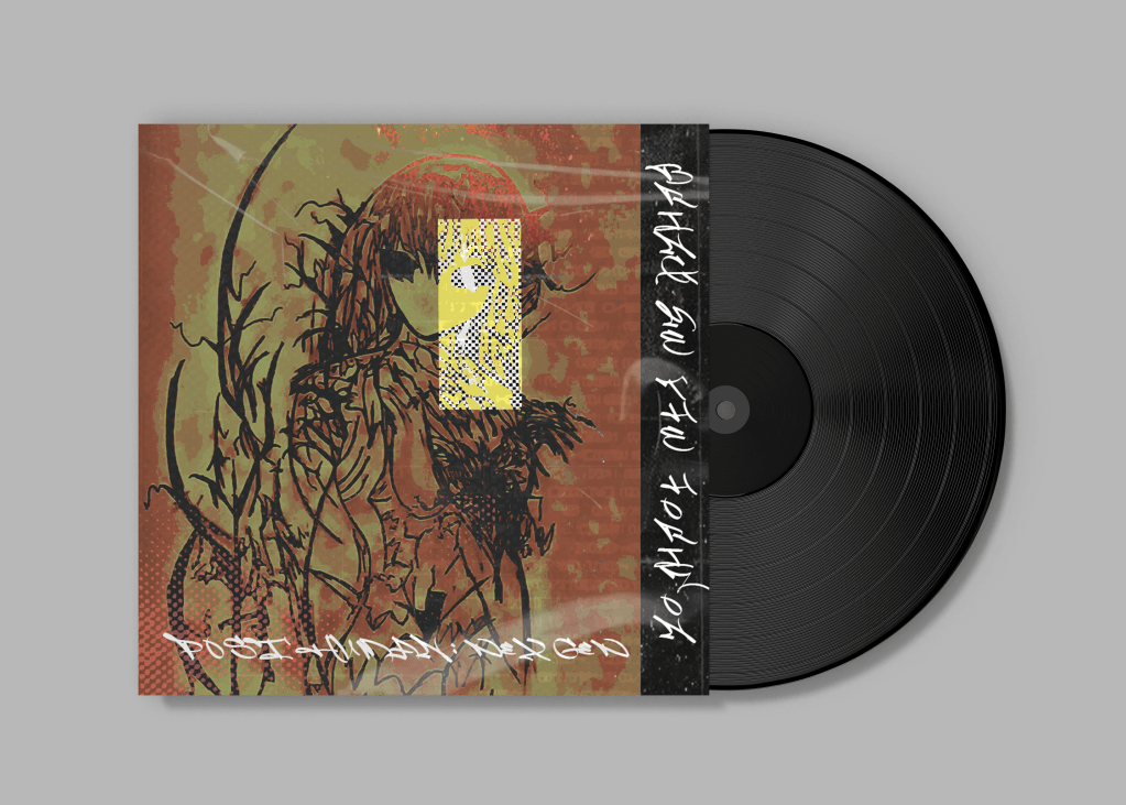

Project Overview
This album cover for Bring Me The Horizon reimagines the band’s sonic intensity through a visceral, almost alchemical fusion of organic decay and digital distortion. The design serves as a visual manifesto for their genre-defying sound—where raw, tactile textures collide with glitch-ridden typography to mirror the band’s evolution from metalcore roots to electronic-infused experimentation for their new album called NEX GEN.
Design Concept
The cover thrives on controlled chaos. At its core lies a tension between:
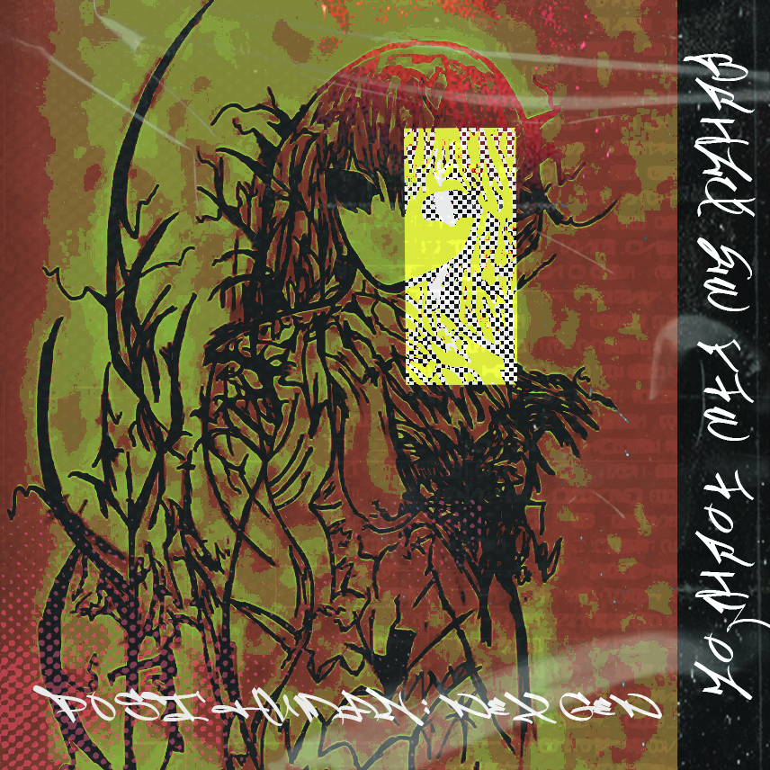
- Organic erosion: The stained, weathered textures evoke a relic unearthed from some post-apocalyptic wasteland, mirroring the band’s themes of societal collapse and rebirth.
- Digital corruption: Fractured typography and pixelated artifacts suggest a file corrupted beyond repair—a metaphor for the band’s deconstruction of musical boundaries.
Color Palette & Typography
Analog Meets Digital:
- The base layer mimics oxidized metal, achieved through scanned textures and manipulated ink bleeds.
- Glitch effects are applied with surgical precision—some areas appear digitally shattered, others smeared like wet ink, creating a dialogue between analog destruction and digital decay.
- The typography undergoes data-moshing, with certain letterforms disintegrating into pixelated noise while others remain eerily intact
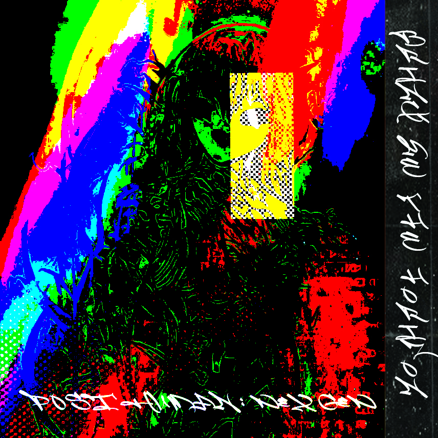
Chromatics of Decay:
A monochrome foundation of bruised blacks, concrete grays, and septic yellows dominates, punctuated by sudden flares of neon static—like a dying monitor flickering back to life. This duality reflects the band’s balance between nihilistic lyricism and electronic sound mixed with metal elements.
Typeface:
The specific typeface represents the soundwave of the band.
Visual Impact
Holding this vinyl feels like clutching a artifact from the future’s rubble. The cover doesn’t just represent Bring Me The Horizon’s sound—it emulates it. The textures seem to vibrate with bass-heavy frequencies; the typographic fractures syncopate like a breakdown; even the negative space hums with eerie reverb. Most strikingly, the design rewards physical interaction. Under light, the spot-varnished elements would catch differently than the matte decays, making each vinyl’s aging process unique—a visual echo of how listeners imprint personal meaning onto the music.
