Project Overview
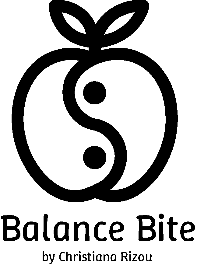
The Balance Bite logo reimagines nutritional harmony through a symbiotic fusion of organic symbolism and minimalist design. Created for dietitian Christiana Rizou, the mark translates the philosophy of balanced eating into a visual haiku—where an apple’s wholesome simplicity merges with the eternal dance of Yin and Yang. This is branding as nourishment: a single bite that delivers both aesthetic clarity and conceptual depth.
Design Concept
The logo’s power lies in its dual heartbeat. At its core pulses the universal symbolism of an apple—nature’s original health icon—sliced open to reveal a Yin Yang motif. The swirling halves speak to:
- The equilibrium between science and intuition in dietary guidance
- The interplay of indulgence and discipline
- The fusion of Eastern holistic wisdom with Western nutritional practice
Two delicate leaves crown the composition, their organic curves softening the geometric precision—a nod to the human element in dietary counseling.
Materials & Techniques
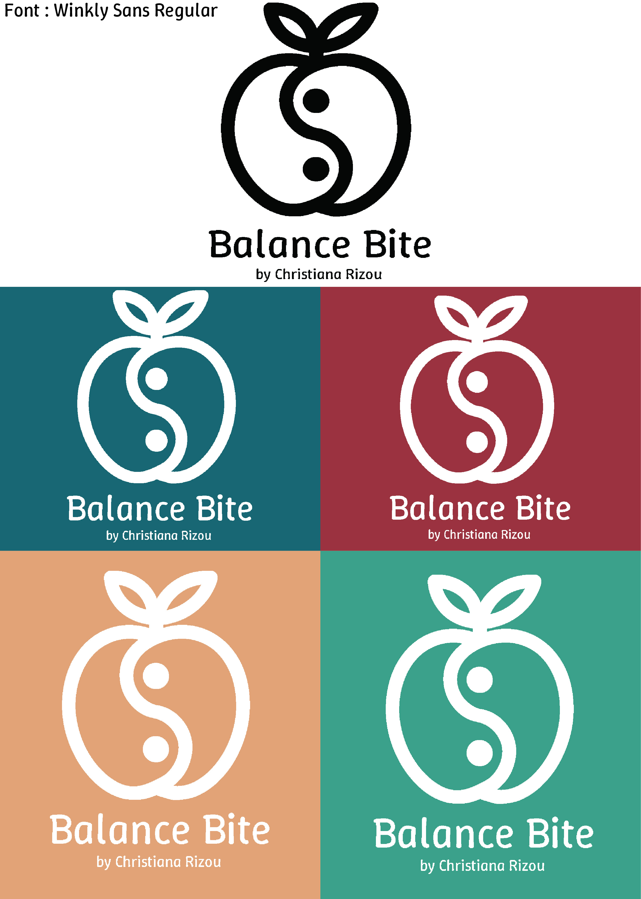
Crafted digitally with surgical precision, the logo maintains an artisanal warmth. The circular form operates like a nutritional seal, its clean vectors ensuring scalability from business cards to social media avatars. Strategic negative space in the Yin Yang’s “bite” creates an illusion of depth, as if the logo itself is being consumed—a playful meta-commentary on the brand’s name.
Color Palette & Typography
Four colorways act as seasonal moods for the brand:
- Petrol (#1C6672): The crisp authority of clinical expertise
- Cherry (#9A333F): The vibrancy of passionate food advocacy
- Pastel Orange (#E0A477): Approachable, sunlit nourishment
- Mint Green (#3BA089): The default voice—fresh, trustworthy, alive
Typeface:
Winkly Sans Regular performs a delicate dance—its rounded terminals and open counters mirror the logo’s friendly curves, while the slight quirk in its ‘a’ and ‘e’ glyphs adds just enough personality to avoid sterile professionalism. The lowercase ‘by Christiana Rizou’ in finer weight creates hierarchy without hierarchy, like a chef’s subtle signature on a composed dish.
Potential Applications
- Branding & Identity: Website, business cards, packaging, uniforms
- Marketing Materials: Advertisements, vehicle wraps, digital campaigns
- Digital Presence: App icon, website header, social media branding
Final Thoughts
This is a logo that behaves. In monochrome contexts, the symbolism retains its clarity; in full color, each variant feels like a different facet of nutritional philosophy. The mark’s circular rhythm gives it a talismanic quality—it could equally grace a recipe book or a clinical white paper. Most brilliantly, the “missing bite” (where Yin meets Yang) invites the viewer to complete the image mentally, engaging them in the very act of balance the brand promotes. By wedding ancient symbolism to contemporary minimalism, the design becomes a timeless vessel—one that could gracefully evolve alongside nutritional science itself. It doesn’t just represent balance; it embodies it through every considered curve and intentional void.
