ACS Logo Redesign
Project Overview
ACS is a well-known courier and logistics service provider, recognized for its speed and reliability. The goal of this redesign was to create a fresh, modern, and dynamic identity that reinforces ACS’s reputation as a fast and efficient delivery service.
Design Concept
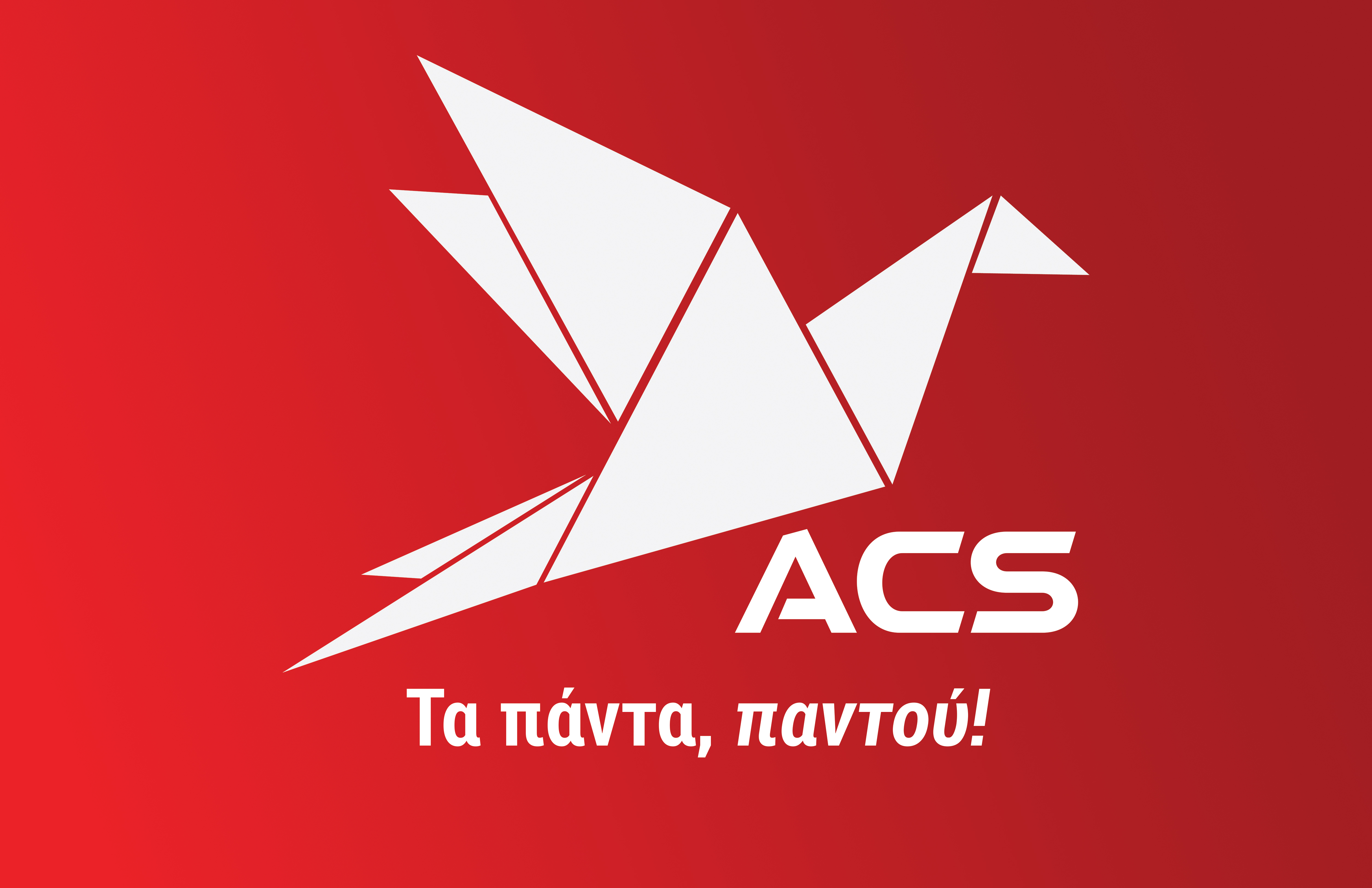
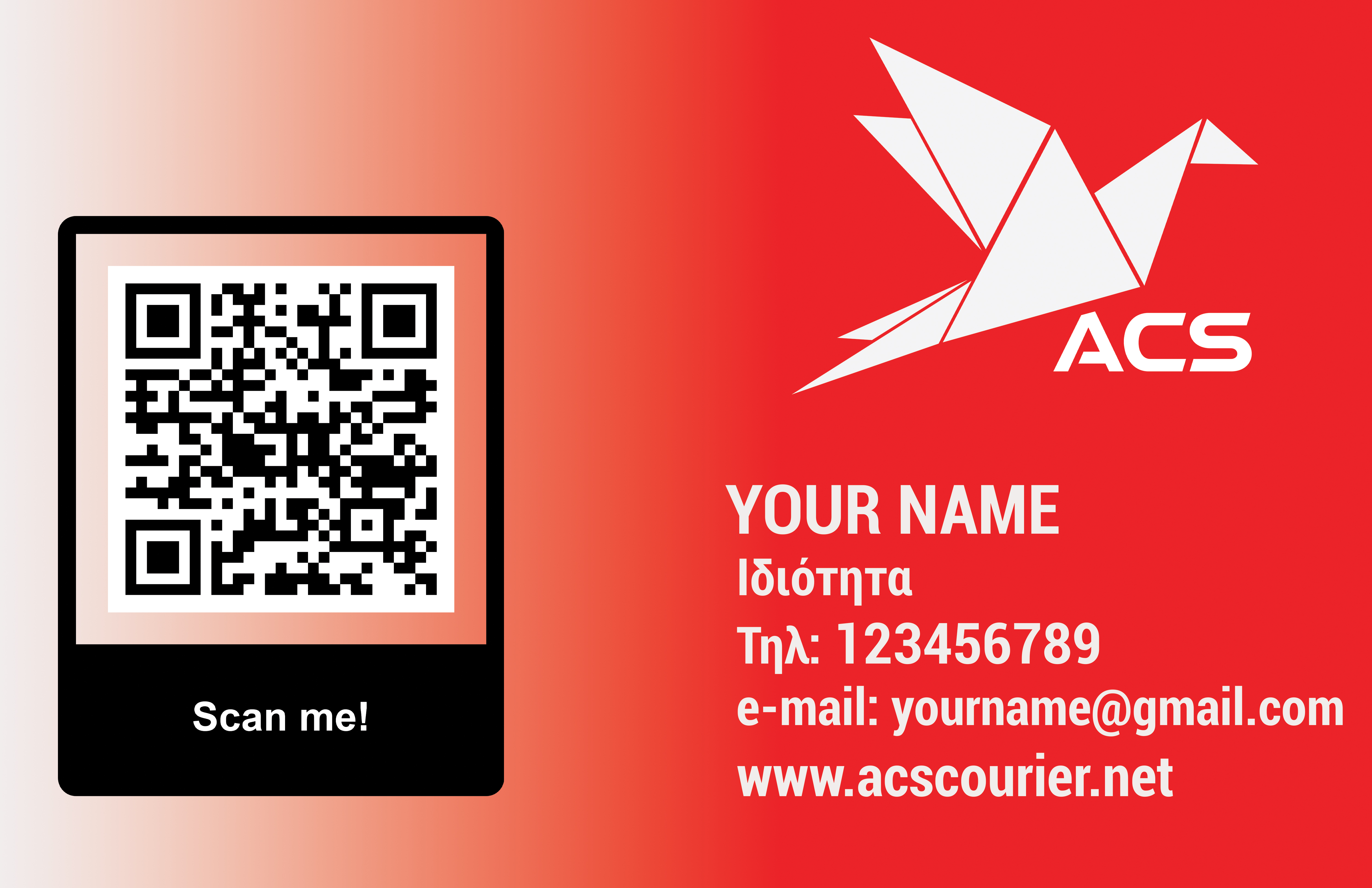
The redesigned logo is inspired by the origami bird, symbolizing speed, precision, and agility. The geometric approach not only modernizes the brand but also conveys a sense of structure and trustworthiness, which are key attributes of a successful courier service.
Key Design Elements
- Origami Bird Symbol: Represents speed, efficiency, and movement, reflecting the company’s core service values.
- Sharp Geometric Lines: Enhance the perception of motion and reliability.
- Red and Dark Red Color Scheme: Red evokes urgency and action, making it a perfect choice for a delivery service. The darker red tones add depth and contrast.
- Bold Typography: The “ACS” text is designed in a sleek, modern font that conveys professionalism and futuristic appeal.
Suitability for ACS
This logo effectively communicates the fast, reliable, and efficient nature of ACS. The dynamic posture of the bird suggests movement and speed, while the structured geometric elements reinforce a sense of organization and trust.
Potential Applications
- Branding & Identity: Website, business cards, packaging, uniforms
- Marketing Materials: Advertisements, vehicle wraps, digital campaigns
- Digital Presence: App icon, website header, social media branding
Final Thoughts
This redesign successfully merges modern aesthetics with brand identity, making ACS stand out in the competitive courier industry. The bold, high-energy design ensures instant recognition, positioning ACS as a forward-thinking and high-speed service provider.
